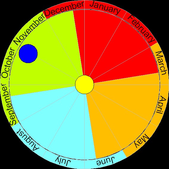
This graphic shows the Earth's postition on its orbit around the sun on November 1st with colors that indicate the southern hemisphere's seasons. I have simplified the picture a bit by writing the months' names into the sectors (the month's colors indicate how seasons are popularly seen) and by putting January, the first month, between 12 and 1 o'clock. Thereby the first hour is the first month, the second hour is the second month, and so on. This is more logical than the previous picture. Again I must say that it's very useful that a year has the same number of months as a dial has hours: 12.