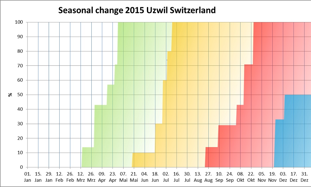
This is my first SIMR visualization for 2015. According to my indicators it shows the progressive arrival of the seasons: spring = green, summer = yellow, autumn = red and winter = blue. It will be interesting to compare this site with other years and with other places in different latitudes. If we compare with the standard timing of the seasons (next picture) it's astonishingly similar: 100% spring at about the same time as the peak of spring, 100% summer about 3 weeks earlier and autumn about 2 weeks earlier than in the standard diagram. Winter attained only 50% so far - the peak of winter is in the first week of February only according to the standard diagram.